





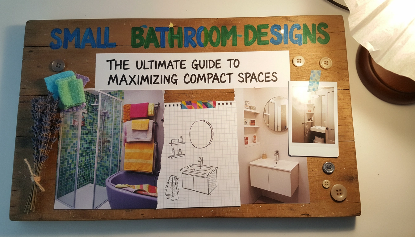

Honestly, most of the advice out there about tiny bathrooms is just complete garbage. I was over at Georgia’s place on Preston Rd in Fremont last Tuesday and her ensuite was basically a tiled coffin. I am not even kidding. People think you can just slap some white paint on the walls and everything magically opens up. It does not.
- Understanding the Foundation of Small Bathroom Designs
- Innovative Space-Saving Layouts for Tiny Bathrooms
- Smart Storage Solutions: Beyond the Standard Cabinet
- Visual Techniques to Expand Your Perceived Space
- Choosing Between Showers and Tubs in Limited Footprints
- The Future of Small Bathroom Designs in 2026
- Final Thoughts on Elevating Your Compact Space
A small bathroom is a high-stakes puzzle where if you miss by even half an inch, you are hitting your hip on the vanity every single morning. You have to be aggressive about the floor plan. Stop thinking about decorating and start thinking about spatial engineering. If it does not serve two or three purposes, it is just clutter. Get rid of it.
Understanding the Foundation of Small Bathroom Designs
Actually, if we are being technical (and we should be), a small bathroom is anything that clocks in under fifty square feet. That is your standard guest powder room or those cramped master ensuites that feel like an afterthought in most 1970s builds. The goal here is spatial optimization. That sounds like corporate speak, but it is really just the art of making sure you can actually dry your legs without hitting the toilet.
We use something called functional layering. This is where every single element in the room has to justify its presence. If a mirror is just a mirror, you have failed. It needs to be a storage unit. If the floor is just a floor, you are missing out.
The Zero-Threshold Concept
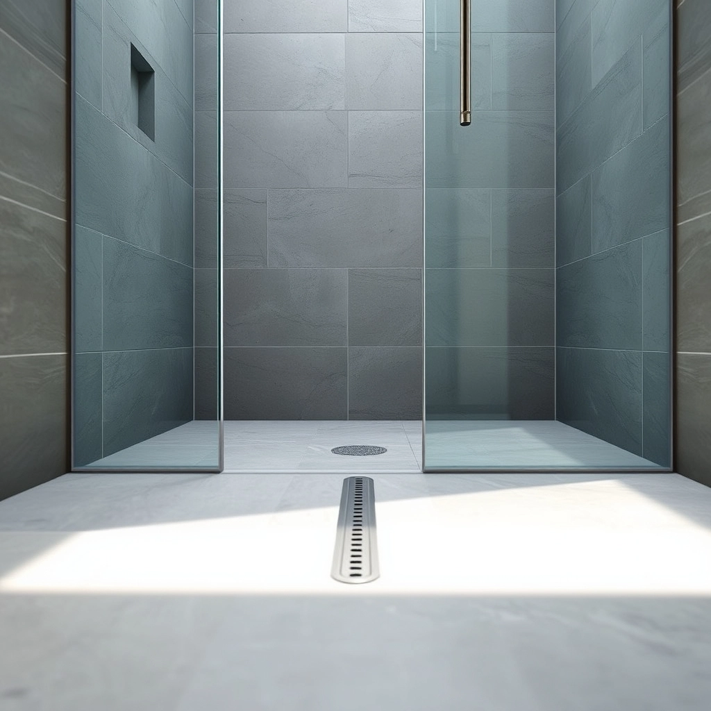
A curbless shower design allows the floor tile to continue uninterrupted into the showering area, which eliminates the visual break that typically makes a small room feel segmented and tiny.
One thing I always look at is the clear floor space (CFS). This is a technical metric (often governed by local building codes like the ADA standards, though residential is more flexible) that dictates how much room a person has to actually rotate. In a tight box, every millimeter of CFS is gold. We are looking at the room as a 3D volume. Not just a 2D floor plan. Think about the air. Think about the elbows. If you cannot move your arms to wash your hair, the design is a failure. Period.
Innovative Space-Saving Layouts for Tiny Bathrooms
The three-in-a-row layout is the bane of my existence. It is cheap for the plumber because all the waste lines are in one wall, sure. But it leaves you with this awkward, skinny runway of floor that is basically useless.
I usually push for centralized circulation.
Actually, moving the vanity to the opposite wall from the toilet—even if it costs a bit more in piping—can completely change how the room breathes. It breaks that tunnel effect. You want the center of the room to be open.
I have put together a quick comparison of how these layouts actually perform when you are trying to squeeze every bit of value out of your square footage.
| Layout Style | Plumbing Complexity | Traffic Flow | Visual Openness |
|---|---|---|---|
| Three in a Row | Low | Linear and cramped | Poor |
| Split Wall | Moderate | Improved | Moderate |
| Wet Room | High | Maximum | High |
My Take
The wet room is the gold standard for anything under forty square feet because it removes the visual clutter of glass doors and bulky curbs.
And then there is the wet room setup. This is where the whole room gets tanked (waterproofed with something like a Schluter-Kerdi membrane).
You do not need a bulky shower curb.
You do not need a glass box that you have to squeegee every day.
The floor just slopes toward a linear drain (usually stainless steel, very sleek).
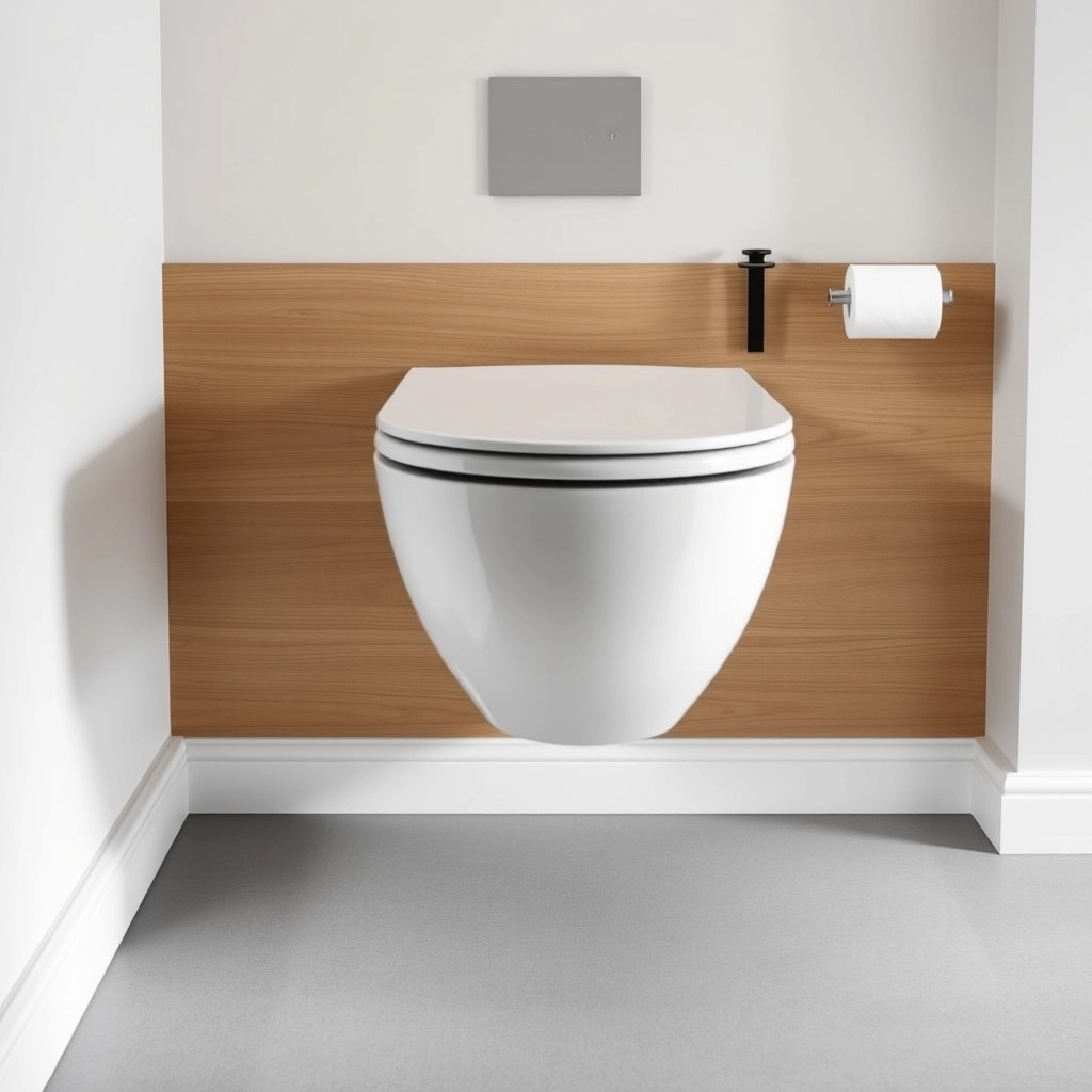
If you are really hurting for space, look at a wall-hung carrier system. I am talking about those toilets where the tank is literally inside the wall studs. It saves about eight inches of depth. In a room that is only sixty inches wide, eight inches is the difference between luxury and misery. Plus, it makes the floor look huge because you can see all the way to the baseboard. It is much easier to mop, too. No more gross hair stuck around the base of the toilet porcelain.
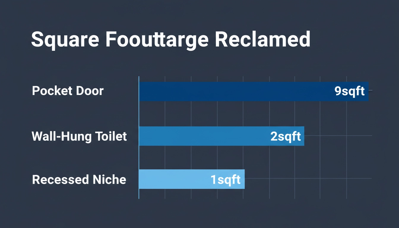
If you are wondering how much room you are actually gaining with these engineering changes, look at these numbers.
The Pocket Door Pivot
Replacing a standard swinging door with a pocket door or a sliding barn-style door can reclaim up to nine square feet of usable floor space that would otherwise be wasted on the door swing.
Smart Storage Solutions: Beyond the Standard Cabinet
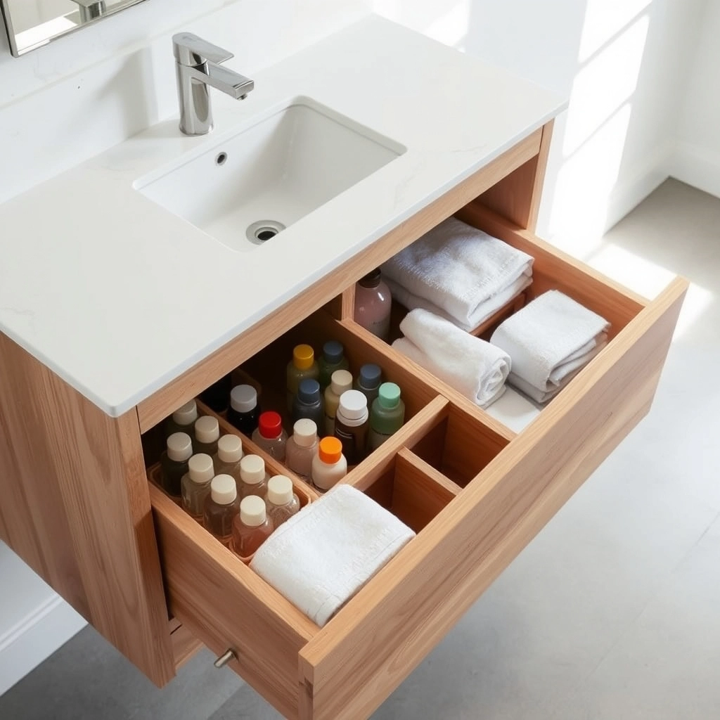
Storage is where people get desperate. They start buying those over-the-toilet wire racks. Please, do not do that. It looks like a dorm room.
The solution is integrated storage.
I will fight for floating vanities until the day I retire. When you can see the floor going all the way under the sink, your brain thinks the room is bigger. It is a literal optical illusion that works every time. But you have to get the drawer configuration right.
Doors are useless in a small vanity.
You open them and have to crawl on the floor to find the spare toilet paper.
Actually, deep drawers are the only way to go. You pull them out, you see everything from the top. Efficiency.
When you are fighting for every inch, you need to know which storage options actually pull their weight without eating your clear floor space.
| Storage Element | Installation Method | Primary Benefit |
|---|---|---|
| Floating Vanity | Wall Mounted | Increases visible floor area |
| Recessed Niche | Between Studs | Zero footprint shelving |
| Recessed Cabinet | Flush Mount | Eliminates forehead hazards |
| Vertical Tower | Floor to Ceiling | Maximizes unused air space |
My Take
Always choose deep drawers over standard doors for vanities; the ergonomics alone will save you from a morning headache trying to find your hairdryer.
Then we go vertical.
I like recessed wall niches. We cut into the drywall between the 16-inch on-center studs. You can line these with the same tile as the walls (maybe a nice 12×24 porcelain with a matte finish) so they blend in. It is free storage. It does not stick out into your walking path. I put them in the shower for the soap and above the toilet for towels.
And mirrors? They should be recessed medicine cabinets. Not the clunky ones that stick out four inches and hit you in the forehead when you lean in to brush your teeth. Get the ones that sit flush with the wall.
Visual Techniques to Expand Your Perceived Space
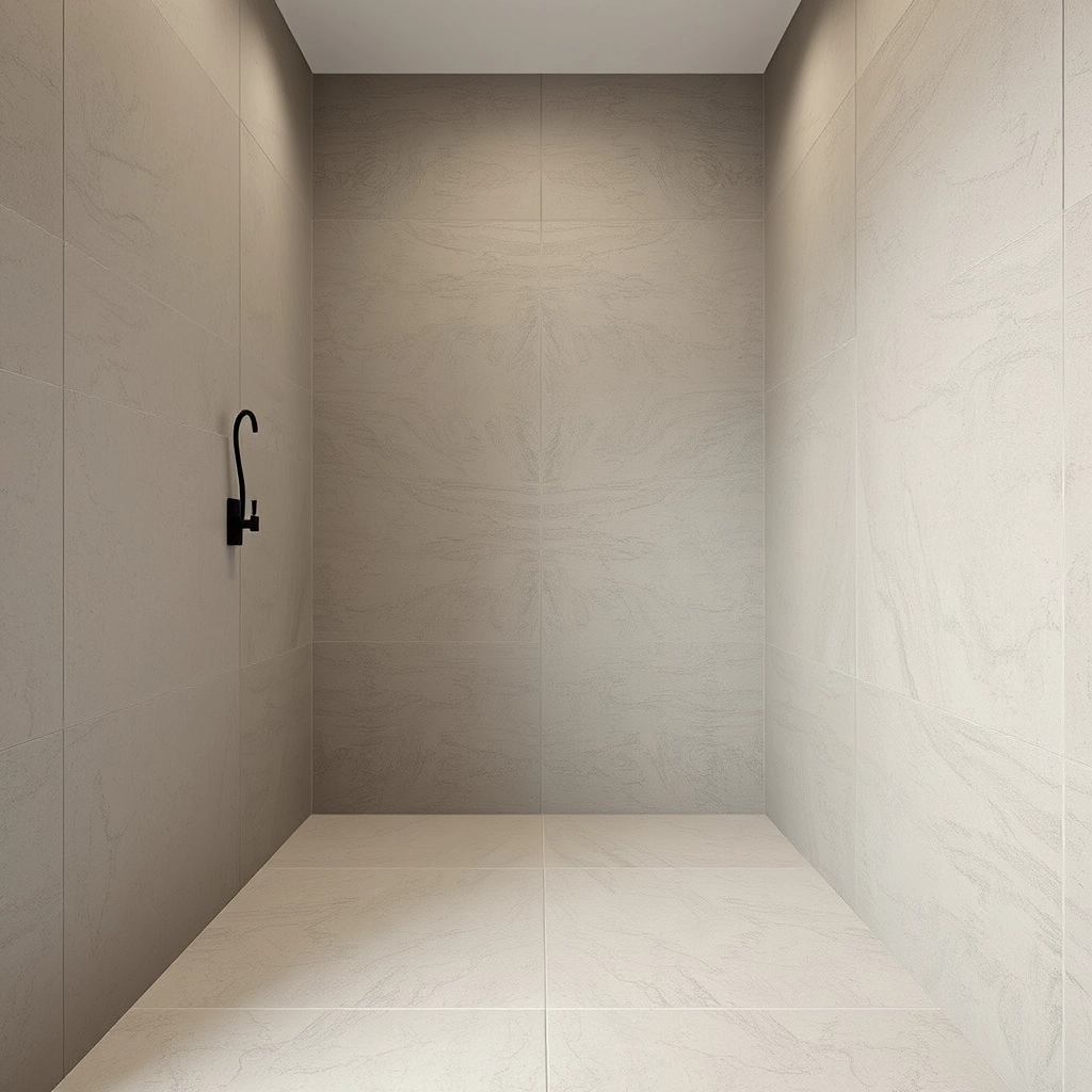
Light is everything. If you have one bulb in the middle of the ceiling, you are living in a cave. You need perimeter LED strip lighting. I usually hide it in a small cove near the ceiling or right under the vanity kick-plate. It makes the walls feel like they are pushed back.
And the color.
Actually, do not just do hospital white. Use a monochromatic color palette.
Maybe a soft sand or a warm grey (Sherwin-Williams Agreeable Gray is a cliché for a reason, it works). When the walls, floor, and even the ceiling are the same tone, the corners of the room just kind of… melt away. The eye does not have a place to stop, so it keeps going.
Large-format tiles are a must.
People think small room equals small tiles. Wrong.
Actually, small tiles mean more grout lines.
More grout lines mean more visual noise.
It makes the room look like a grid. A cage.
Use those massive 24×48 slabs. You might only have three or four grout lines in the whole room. It looks like a single sheet of stone. It is expensive to install because the floor has to be perfectly level (L/360 deflection rating, usually), but it is worth every cent.
Avoid Busy Patterns
While a bold wallpaper might look tempting in a small space, high-contrast patterns can make the walls feel like they are closing in on you by creating too many focal points for the eye to process.
Choosing Between Showers and Tubs in Limited Footprints
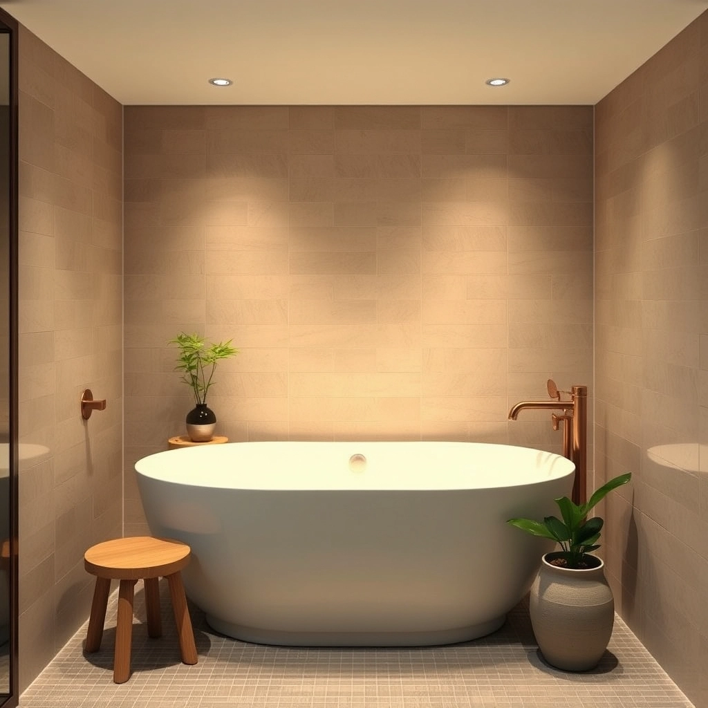
This is the big debate. If you are not a bath person, do not put a tub in just for resale value. That is a myth. People want a nice shower. A walk-in shower with a fixed glass panel (10mm tempered glass is the standard) is so much better.
It keeps the sightline open.
If you absolutely must have a tub, look for a petite soaking tub. They make them shorter but much deeper (the Japanese style). You can actually submerge your whole body without needing a six-foot-long alcove. Georgia ended up going with one of these in a 54-inch model, and it is stunning.
It becomes a piece of art.
In really tight spots, zone-based planning is your friend. This is where we group the wet stuff together. You might have the tub actually inside the shower enclosure. It sounds weird, but it saves a massive amount of floor space and it feels like a high-end spa.
The Future of Small Bathroom Designs in 2026
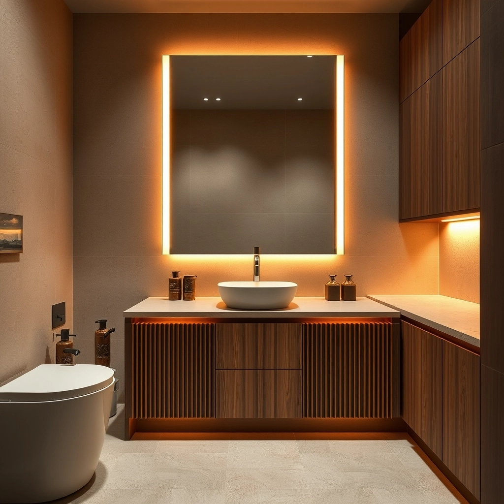
By 2026, we are moving away from that cold, sterile look. The new vibe is undisturbed refinement. (We used to call it something else, but let us stick to the materials). We are talking travertine, brushed nickel that actually feels heavy in your hand, and fluted wood vanities.
Warm neutrals.
Sand.
Terracotta.
We are using tactile interest.
Natural stone vessel sinks that have a bit of texture on the outside but are smooth on the inside. It makes the small space feel like it was built with intention. It is not just a room you have to use; it is a room you want to be in.
And the tech is getting better. smart mirrors that do not fog up. Integrated lighting that turns on automatically when you walk in at 2 AM so you do not blind yourself.
Sustainability is also a big deal. Low-flow faucets that do not feel like a weak drizzle. We are seeing a lot of high-efficiency fixtures that use air-injection technology to keep the pressure high while using less water.
Final Thoughts on Elevating Your Compact Space
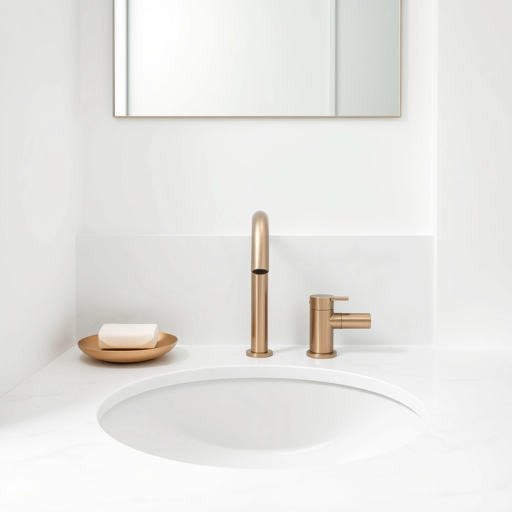
Designing a small bathroom is about restraint. You cannot have everything.
Pick one or two things to be the star.
Maybe it is a beautiful piece of marble or a really cool faucet.
Everything else needs to be quiet.
If you prioritize the flow and the light, the size does not matter. I have seen 40-square-foot bathrooms that feel more luxurious than 200-square-foot ones. It is all in the details. The clear floor space. The functional layering.
Drop a comment below if you are struggling with a weird layout. I have probably seen it before. Let us talk about how to fix it.