






honestly there’s nothing that ruins a morning faster than smacking your elbow on a freezing shower door because the builder thought a standard swing was fine for a four-foot wide room. it’s just bad design. i was looking at a project for Wayne over on Park Road—St Albans—and the previous guys basically wedged a vanity in so tight you couldn’t even open the drawers properly without hitting the toilet. like why? people treat these tiny bathrooms like storage closets with a toilet but you actually spend so much time in there.
- Understanding the Basics of Compact Design
- Miniature Bathroom Ideas to Maximize Every Square Foot
- Miniature Bathroom Layout Ideas for Smart Space Planning
- Storage Solutions for Miniature Bathroom Ideas
- Miniature Bathroom Tile Ideas to Create an Illusion of Space
- Floating Fixtures and Vanities for Miniature Bathroom Designs
- Conclusion
It should feel like a spa even if it’s the size of a postage stamp. anyway i’m typing this while waiting for a tile delivery but i wanted to get these thoughts down because people keep making the same mistakes over and over. you don’t need a massive room to have luxury. you just need to stop being lazy with the layout.
Understanding the Basics of Compact Design
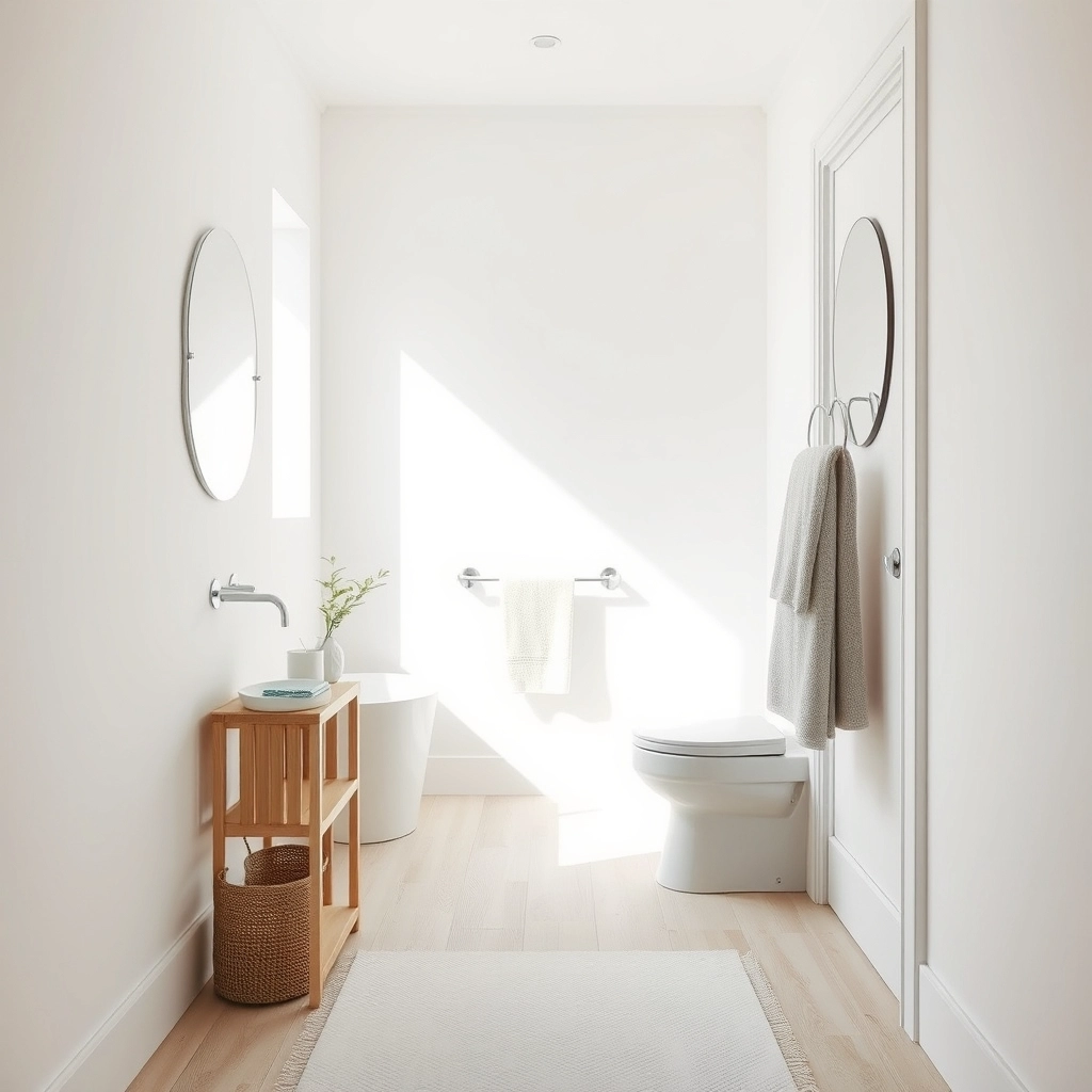
So, officially, we’re talking about anything under forty-five square feet. That’s the technical cutoff for a miniature bathroom. But honestly? It’s more of a feeling than a number. It’s that volumetric planning thing—which is just a fancy way of saying you have to stop thinking about the floor and start thinking about the air (the three-dimensional cube). If a fixture doesn’t look stunning and work perfectly, it’s out. Period.
Actually, the goal is spatial harmony. I know, it sounds a bit like something you’d hear in a yoga studio. But in design, it’s just the balance between the heavy stuff (the porcelain and the stone) and the negative space. You need the empty space to breathe. If you pack every inch with a cabinet or a towel rack, the room feels like it’s closing in on you. I’ve seen it happen. People panic and buy the biggest vanity they can find because they’re worried about storage, and then they can barely stand in front of the sink.
I put together this quick breakdown of what I mean by spatial harmony so you can see the balance I am talking about.
| Design Element | Main Purpose | Impact on Your Room |
|---|---|---|
| Heavy Fixtures | Functional utility | Defines the basic floor plan |
| Negative Space | Visual breathing room | Prevents a cramped or ‘stuffed’ feeling |
| Light Flow | Eliminating shadows | Expands the perceived boundaries of the walls |
My Take
Think of negative space as a luxury feature. It is not ‘wasted’ space; it is the secret to making a small room feel ‘high-end’ rather than cluttered.
The basics mean recognizing that transitions matter. When you walk from the hallway into a tiny bath, it shouldn’t feel like you’re entering a bunker. The flow of light has to be intentional. We focus on the furthest corner first. If the furthest corner is dark, the whole room feels small. Actually, a concentrated expression of style works better in small spaces. You can afford the crazy expensive marble (maybe a nice Calacatta with heavy veining) because you only need ten square feet of it.
Miniature Bathroom Ideas to Maximize Every Square Foot
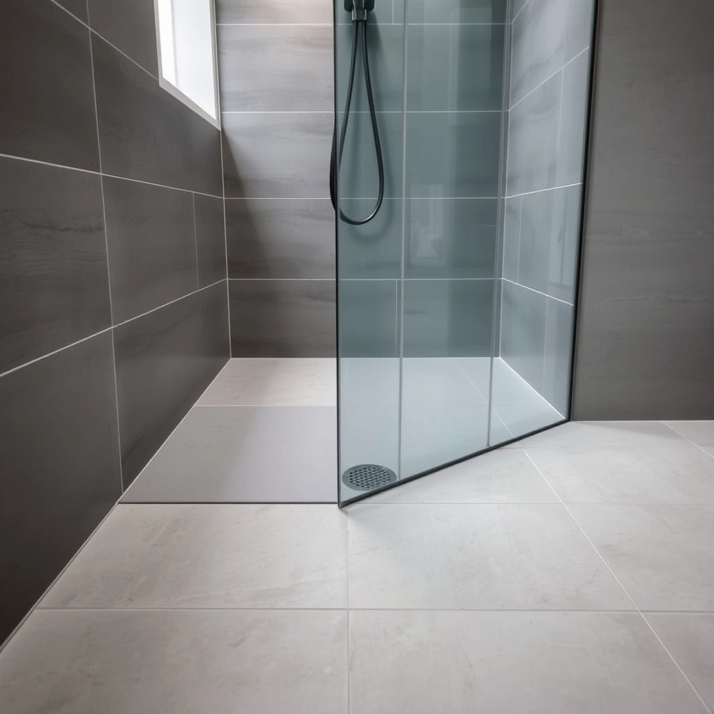
You have to be ruthless. I tell clients this all the time. One of the best ways to fix a tiny room is a wet room configuration. You just get rid of the shower curb. The whole floor slopes to a linear drain—usually brushed nickel or matte black to match the taps—and it removes that visual trip-wire of a shower tray. Actually, this seamless floor plane is my favorite trick. It makes the floor material (hopefully a nice 24×24 porcelain) run uninterrupted from wall to wall. It tricks the brain.
The door is usually the biggest problem. A standard swinging door requires nearly nine square feet of clearance zone just to open. That’s nine square feet of dead space where you can’t put a toilet or a towel bar.
If you are struggling with a door that hits everything, look at how much room you actually gain by switching styles.
| Door Option | Floor Space Needed | Best Use Case |
|---|---|---|
| Standard Swing | 9 Square Feet | Large entries only |
| Pocket Door | Zero Square Feet | Full ‘down to the studs’ renovations |
| Barn Slider | Zero Square Feet | Walls with internal pipes or wiring |
My Take
I always push for the pocket door if the budget allows. It makes the room feel like it was ‘custom-built’ for the house rather than just an afterthought.
By installing a pocket door (the kind that slides into a recessed cavity in the wall), you reclaim all of that floor. If your wall is load-bearing or full of pipes and you can’t do a pocket door, then a barn-style sliding door on the outside of the room is the next best thing. It’s about reclaiming the footprint. Wayne’s place on Park Road had this exact issue; the door hit the vanity every time. We swapped it for a slider and suddenly the room felt twice as big.
The Power of Reflection
Install a floor-to-ceiling mirror behind your vanity instead of a framed medicine cabinet. This doubles the visual depth of the room and reflects every available lumen of light, creating an immediate sense of ‘airiness’ that frames cannot achieve.
Miniature Bathroom Layout Ideas for Smart Space Planning
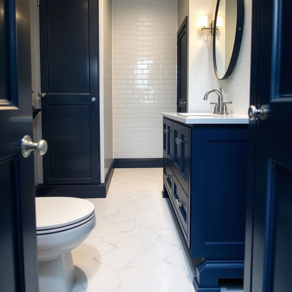
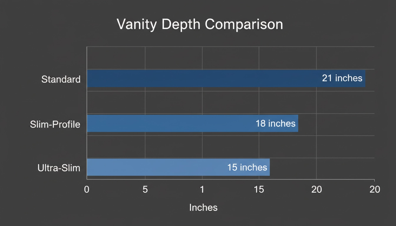
Smart planning means ignoring standard fixture sizes. Why put a twenty-one-inch deep vanity in a narrow room? It’s bulky. Actually, a slim-profile model—maybe fifteen or eighteen inches—gives you those extra few inches of walking space. It’s the difference between a room that feels like a hallway and one that feels like a sanctuary. You have to follow the clearance requirements (usually 15 inches from the center of the toilet to any wall), but you can play with the depths of the other pieces.
Sometimes seeing the numbers helps people realize why that extra few inches of walking room matters so much.
My Take
Go for the eighteen-inch depth. It is the ‘sweet spot’ where you still get a decent sink bowl without losing your vital walkway.
Another strategy is the corner-oriented approach. People forget corners exist. A pedestal sink or a specialized corner vanity can open up the center of the room. It’s great for square-shaped bathrooms where you feel stuck in the middle.
Actually, the goal is unidirectional flow. You want the user to move easily from the door to the vanity to the shower without having to do a weird pivot or a side-shuffle. It’s about intuition. The room should guide you. When we planned the layout for the St Albans project, we moved the towel bar to the back of the door just to keep the main wall clear. Small moves make the difference.
Ventilation Essentials
Small bathrooms trap moisture more quickly than large ones, leading to mold and material degradation. Always specify a high-CFM (cubic feet per minute) extraction fan that is rated for a much larger space to ensure rapid air turnover.
Storage Solutions for Miniature Bathroom Ideas
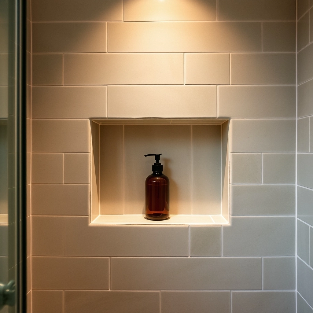
Storage is usually where things go sideways. Clutter is visual noise. If you have three bottles of shampoo and a hair dryer sitting on the counter, the room shrinks instantly. The solution? Look into the stud bays. These are the hollow spaces between the wooden supports in your walls (usually 16 inches apart).
By creating recessed niches—integrated alcoves—you get storage depth without taking up floor space. Line them with the same tile as the walls (maybe a nice handmade Zellige with some texture) so they blend in. It looks architectural rather than added-on.
Verticality is huge here. Use it. Floating shelves that go all the way to the ceiling can hold the stuff you don’t use every day. It draws the eye up. It makes you notice the height of the room instead of the narrowness of the floor. For a cleaner look, use integrated cabinetry. No handles. No knobs. Just push-to-open latches. It keeps the silhouette sleek. Actually, the less your eye has to trip over, the better the room feels.
Miniature Bathroom Tile Ideas to Create an Illusion of Space
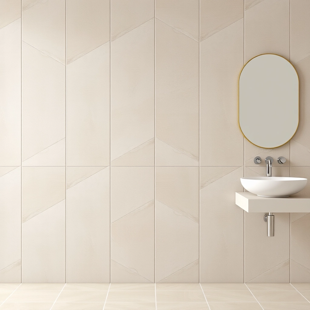
Tile selection is the biggest tool we have. People think small tiles are for small rooms. Wrong. Actually, the opposite is true. Large-format tiles (like 12×24 or larger) have fewer grout lines. Grout lines are a grid. A grid makes a room look like a cage.
People get confused about tile sizes, so here is a cheat sheet on how different formats affect the look of your walls and floors.
| Tile Size Choice | Grout Line Density | Visual Result |
|---|---|---|
| Small Mosaic | Very High | Busy and textured |
| Standard 4×4 | High | Traditional grid pattern |
| Large 12×24 | Low | Sleek and expansive |
| Slab Material | None | Seamless luxury look |
My Take
Stick to the large format tiles. Fewer lines mean less cleaning and a much bigger-looking room. It is a ‘win-win’ for any small renovation.
When you reduce the grid lines and color-match the grout to the tile, the surfaces look monolithic. It’s expansive. I like using a honed marble or a satin-finish porcelain. It feels expensive and soft.
The direction you lay the tile matters too. If you lay floor tiles on a diagonal or a chevron pattern, you’re forcing the eye to follow the longest path possible across the room. It creates width. For the walls, try a vertical stacked-bond pattern. It’s very modern and it makes a standard eight-foot ceiling feel like it’s ten feet high. Sensory materials add that layer of tactile quality that makes you forget you’re in a tiny space.
The Gloss Factor
Reflective surfaces like polished ceramic or glass tiles act as a secondary light source. By bouncing light into the shadows, these ‘high-luminance’ materials prevent the corners of a miniature bathroom from feeling dark or oppressive.
Floating Fixtures and Vanities for Miniature Bathroom Designs
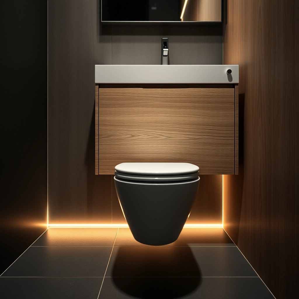
Floating fixtures are the gold standard for these projects. When you wall-mount the vanity and the toilet, you can see the continuous floor material all the way to the wall. The brain sees more floor, so it thinks there’s more room. Simple.
This unbroken sightline is everything. Wall-hung toilets also use an in-wall carrier (the tank is literally hidden in the wall). This saves about eight inches of depth. Eight inches! That’s huge in a small bath. Actually, the floating vanity should be thin-edged. A thick, chunky countertop will just make the room feel heavy.
Even a tiny gap—maybe six or eight inches—under the vanity makes a difference. If you put a motion-activated LED strip under there, it creates a floating effect. It’s a bit of theater, but it works. It adds that elite feel without needing extra square footage.
Conclusion
Making a miniature bathroom look good is really just about refined editing. You have to be okay with saying no to things. When you prioritize high-quality materials—like a solid brass faucet or a thick slab of stone—over sheer size, you get something better. You get a retreat.
Keep the palette unified. Don’t try to use five different colors. Pick a vibe and stick to it. Whether it’s the seamless tile transitions or the recessed storage, the goal is to make it feel tailored. Your bathroom shouldn’t be a compromise. It should be a masterclass in how to live well in a Small Bathroom Designs footprint. Less is more, provided the less is actually perfect.