






Most people pick bathroom paint colors like they are picking a sandwich—quick, safe, and totally boring. But look, I was just looking at a slab of Azul Macaubas with my client Amelia the other day and it hit me again how much we settle for fine when we could have transcendent. Honestly, most bathrooms look like hospital waiting rooms because people are terrified of anything that isn’t beige or grey. It is pathetic.
I am typing this while waiting for a tile delivery that is already twenty minutes late, but I need to get this out. Blue isn’t just a color. It is a physiological trigger. You want to feel like your blood pressure is actually dropping the second you walk in? That is what we are doing here. Forget the pop of color nonsense. We are talking about immersion. It is about the way the light hits a wet surface and makes you forget your mortgage for ten minutes.
I have spent years watching people play it safe with beige, so let us look at how blue actually changes the energy in a room before you pick up a brush.
| Blue Shade | Emotional Impact | Best Room Type |
|---|---|---|
| Deep Navy | Authority and Security | Primary Suites |
| Soft Aqua | Clarity and Freshness | Guest Bathrooms |
| Slate Blue | Stability and Calm | Family Bathrooms |
| Electric Blue | Energy and Focus | Modern Powder Rooms |
My Take
Color is not just about aesthetics; it is about how you want to feel when you are brushing your teeth at six in the morning. Choose a shade that matches your natural energy level.
Understanding the Foundation of Blue Bathroom Ideas
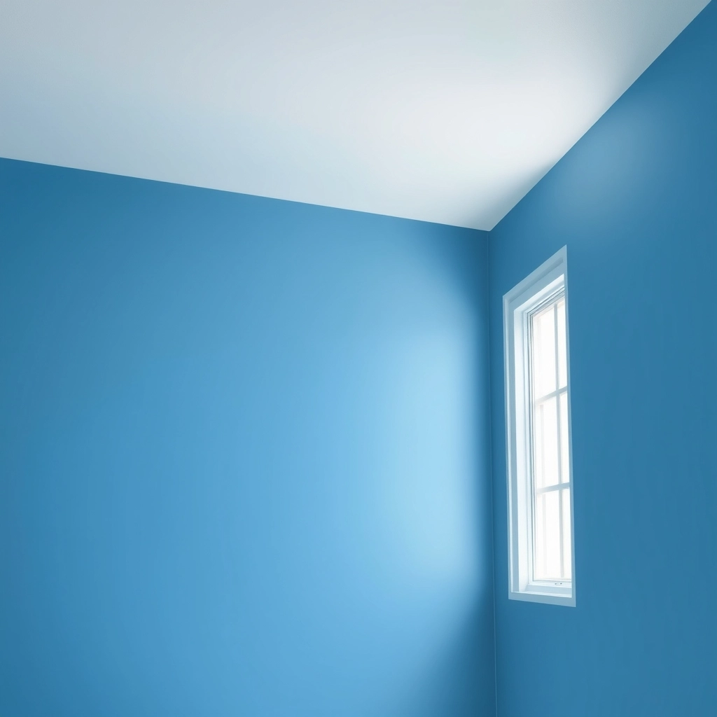
Actually, blue bathroom design isn’t just about picking a paint swatch from a big box store and hoping for the best. It is about how light vibrates against a surface. If you don’t understand how light (specifically the bathroom vanity lights) interacts with pigment, you’re going to end up with a room that looks like a cold swimming pool. Or worse, a nursery. We have to look at how different tones change the way a room feels. Is it big? Is it small?
In the world of high-end design, we talk about undertones and saturation. These aren’t just fancy words. They are the difference between a room that feels like a heavy blanket and one that feels like a breath of fresh air. When I’m working on a project in Cedar Hill, I have to think about the specific humidity and the way the sun hits the house.
The Psychology of Blue
Research in color therapy suggests that blue wavelengths can physically reduce blood pressure and slow breathing, making it the ideal choice for spaces dedicated to relaxation and hygiene.
You have to start by looking at your light. If you have a north-facing bathroom, it is going to be naturally cold. (Technical note: North light is heavy on the 6500K-7500K spectrum). If you put a cool blue in there, the room will feel dead. You need a blue with a tiny bit of red or yellow in it to give it some life. On the flip side, if you have a southern exposure, you can go with those crisp, icy blues and they won’t feel like a morgue.
Watch the paint. Watch it at 8 AM. Watch it at 4 PM. If it looks like mud when the sun goes down, you picked the wrong one.
If you ignore the science of light, you are going to hate your finished product, so look at how these Kelvin ratings change everything.
| Light Source | Kelvin Range | Effect on Blue Paint |
|---|---|---|
| Natural Sunlight | 5000K to 6000K | Shows the truest version of the color |
| Warm LED Bulbs | 2700K to 3000K | Can make cool blues look slightly green or muddy |
| Cool Daylight Bulbs | 4000K to 5000K | Enhances blue tones but can feel clinical |
My Take
I always tell my clients to buy three different light bulbs before they commit to a paint color. Light is the most important ‘material’ in your bathroom.
Navy Blue Bathroom Ideas for Modern Luxury
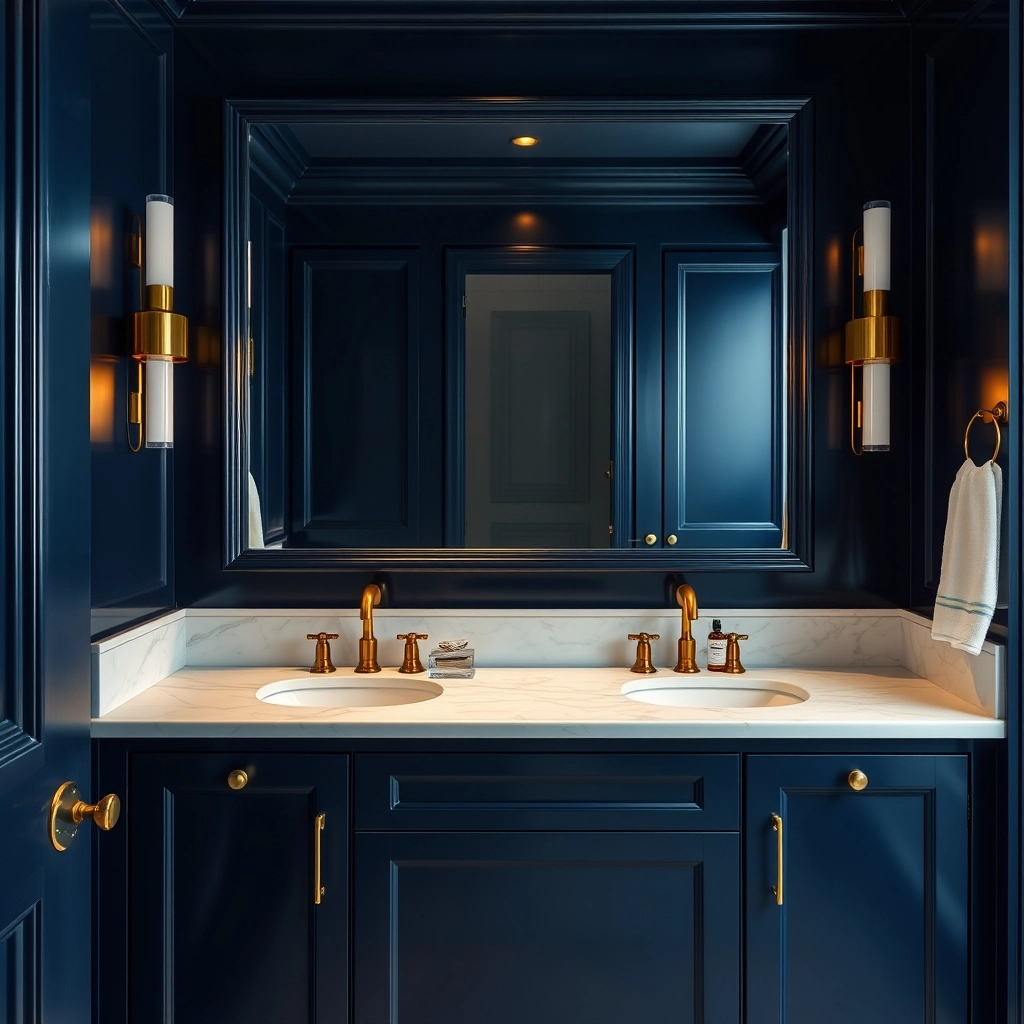
Actually, the idea that dark colors make a room look tiny is a total lie. I spend half my life correcting this. When we look at navy blue bathroom ideas, we are actually playing with something called chromatic depth. It is a trick of the eye. Dark walls don’t close in on you; they recede. They feel like they are going on forever.
Think about a deep indigo. Or a midnight navy. It is a backdrop. It makes the white porcelain of the sink or the gold of the faucet pop like jewelry on a velvet tray. It is high-stakes. It is expensive. Lighter colors can’t do that. They just sit there.
But you can’t just use flat paint. You need texture. I am talking about a high-gloss lacquer that reflects the light (Spec: 90% gloss unit) or maybe bathroom wallpaper ideas that you can actually feel with your fingers. The way the light skips off a textured dark surface is everything. It keeps the room from feeling like a cave.
And the cabinets. Don’t go cheap here. A floating vanity in a dark wood grain, maybe a navy-stained oak, with a marble bathroom vanity on top. It feels heavy. It feels permanent. It is a focal point that tells everyone you know exactly what you are doing.
Hardware Harmony
For navy bathrooms, use unlacquered brass or champagne gold hardware to provide a warm counterpoint to the cool depths of the blue.
Everyone thinks navy is a one-note song, but the finish you choose dictates whether the room feels like a tomb or a high-end lounge.
| Finish Type | Reflective Value | Visual Result | Maintenance Level |
|---|---|---|---|
| Matte | Very Low | Absorbs light for a velvety, modern look | High (shows fingerprints) |
| Satin | Medium | Soft glow that hides imperfections | Low |
| High Gloss | Very High | Mirror-like finish that adds massive depth | Medium |
My Take
If you are going for a luxury vibe, go with the high gloss on the vanity and matte on the walls. That ‘contrast’ is what makes the room look expensive.
Light Blue Bathroom Ideas for Small Spaces
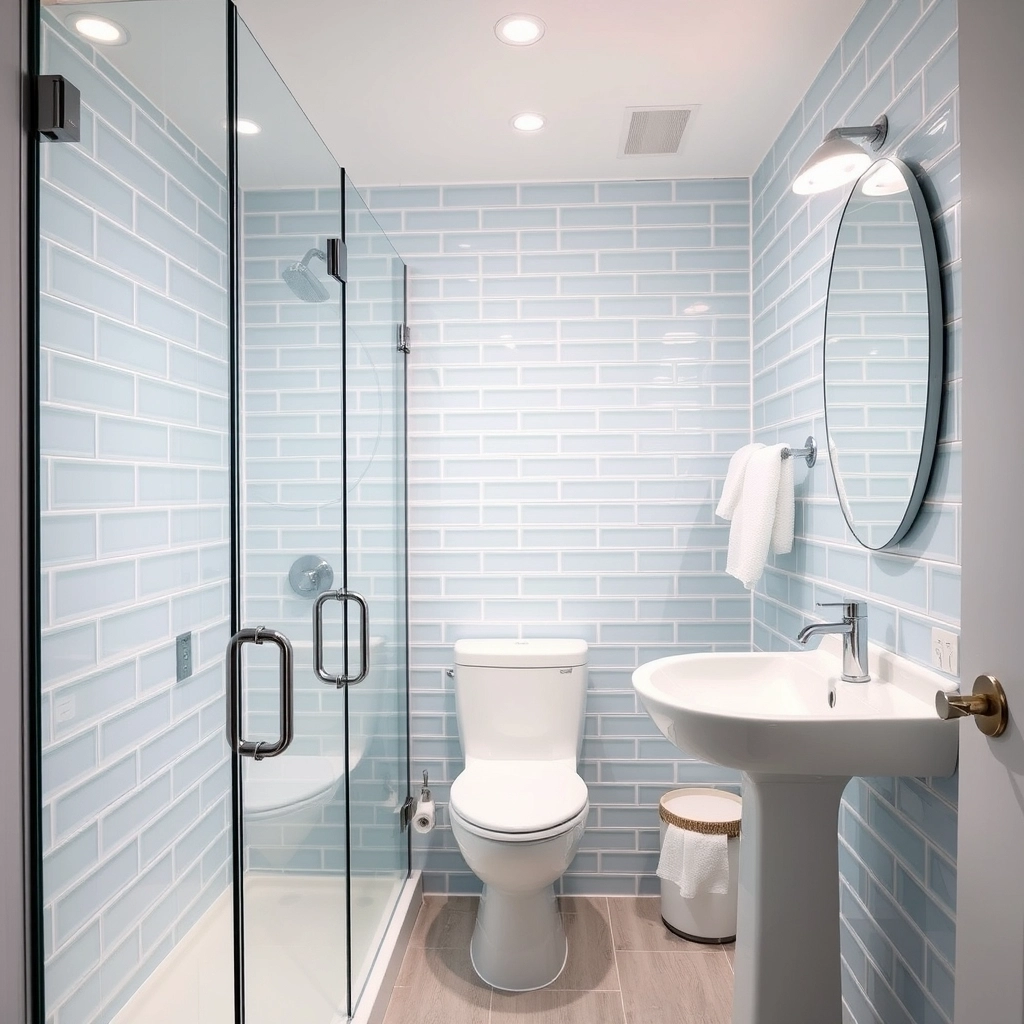
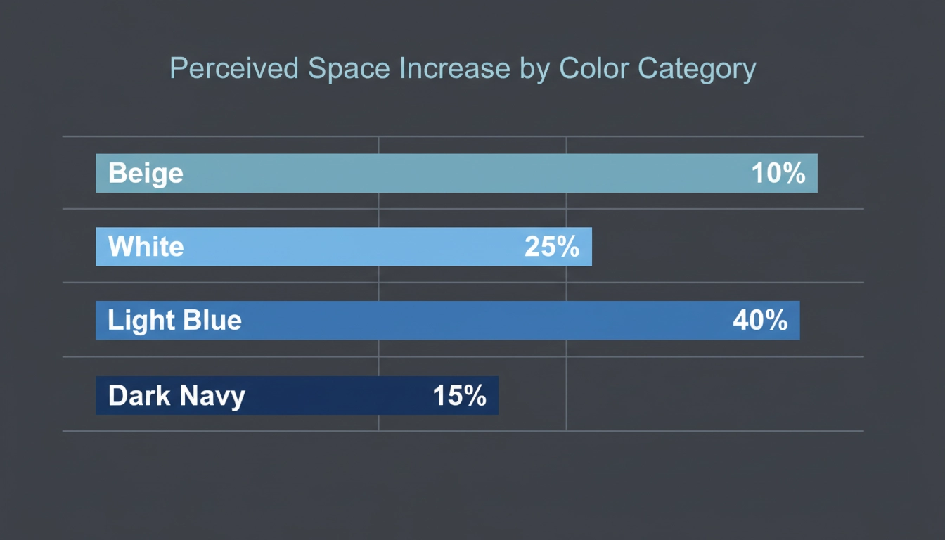
If you are stuck with a tiny footprint, small bathroom designs are your best friend. But you have to use atmospheric perspective. This is a technique where you use soft, faded tones—think misty sky or a very pale aqua—to trick the brain into thinking the walls are further away than they are.
When you wrap a whole room in one light blue, the corners disappear. The ceiling feels higher. It is a monochromatic envelope. I use this a lot for guest baths where space is a nightmare.
Material is huge here. I usually tell people to go for oversized glass tiles. Pale blue glass. The translucency is key. It adds a layer of depth that paint just can’t touch. It makes the walls look like they are made of frozen water.
Use a clear glass shower door. Don’t cut the room in half with a curtain. Keep the view open. Keep the surfaces reflective. You take a space that should feel like a closet and you turn it into a place where you can actually breathe. It is about making the most of what you have.
Small bathrooms are a puzzle, and these specific light blue strategies are the pieces that make the walls feel like they are moving back.
My Take
The reason light blue wins over white is because it provides ‘visual air’ without looking sterile. It is a designer secret for making a five-by-eight bathroom feel like a spa.
Blue Tile Bathroom Design Ideas and Trends
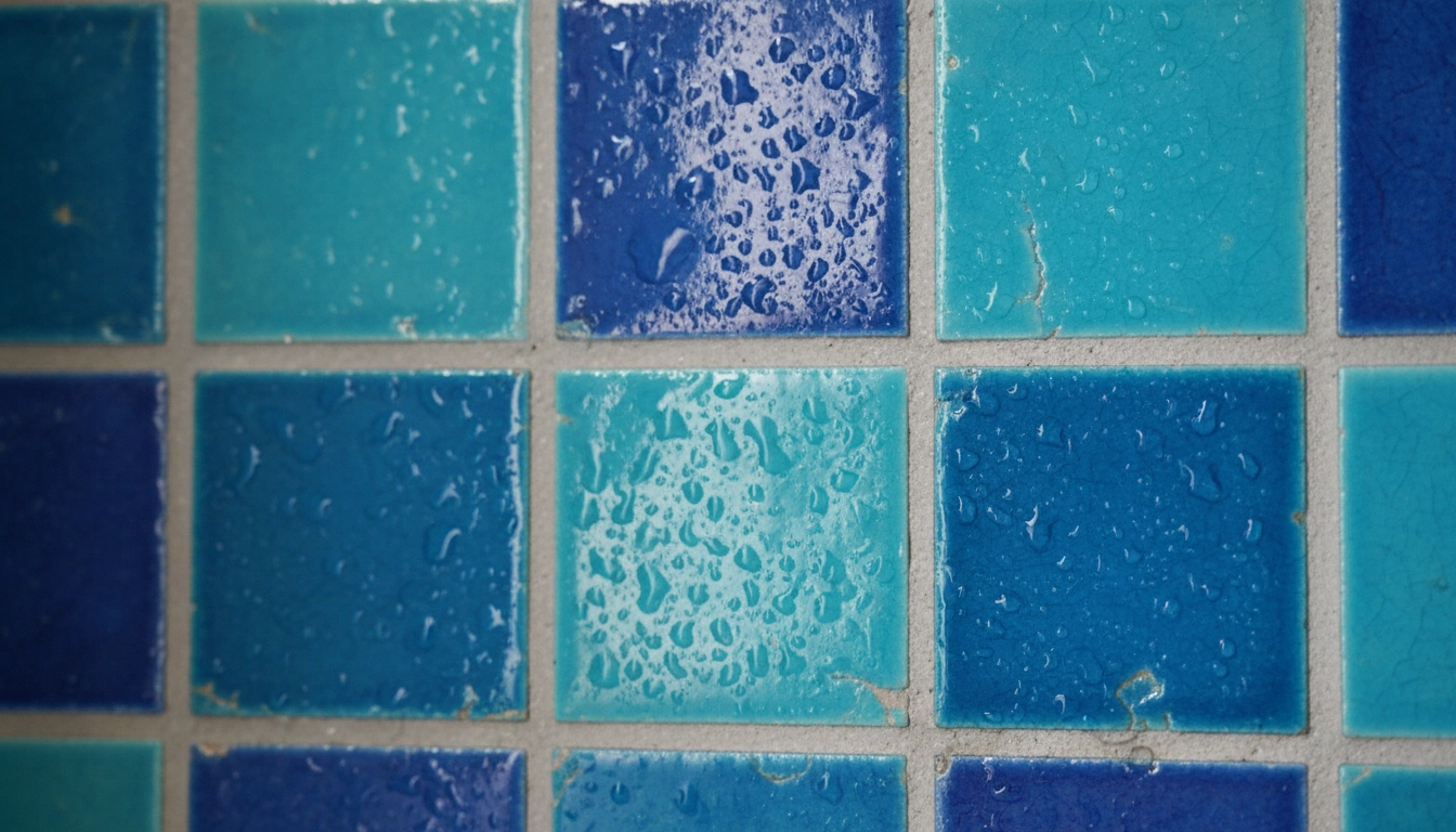
The scene for blue bathtub tile right now is moving away from that boring, flat look. People want artisanal irregularity. I am obsessed with zellige tiles. They are handmade in Morocco and they are perfectly imperfect. One tile might be a little darker, the next might have a little chip or a wavy edge.
When you put them all on a wall, it looks like the ocean moving. It is tactile. You want to touch it. It brings a human element into a room that usually feels too clinical.
Then there is the floor. Forget the basic stuff. We are seeing a lot of geometric blue patterns. Cement tiles with navy and white motifs. It grounds the room. It gives your feet something to look at so the walls can stay simple and quiet.
Or try a herringbone layout. Long, skinny subway tiles in a denim blue. It creates motion. It leads your eye toward the bathtub or a big window. It is a subtle way to add energy without screaming for attention.
__PROTECTED_BLOCK_11__
Choosing a tile is not just about the color; it is about the personality of the shape and the way it handles light.
| Tile Style | Visual Character | Best Application |
|---|---|---|
| Zellige | Textured and shimmering | Feature walls and showers |
| Subway | Orderly and classic | Wainscoting or full walls |
| Penny Tile | Playful and vintage | Shower floors and niches |
| Large Format | Sleek and seamless | Modern floors and walls |
My Take
If you use a textured tile like Zellige, keep your fixtures simple. You do not want too many ‘divas’ in one room.
Coastal Blue Bathroom Ideas with White Accents
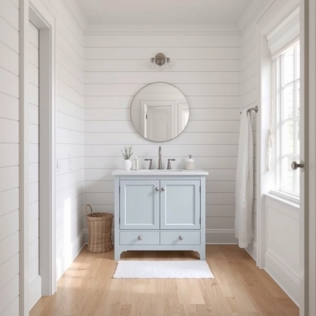
If you want a coastal look, please, for the love of everything, stay away from anchors and rope mirrors. It is tacky. Real coastal blue bathroom ideas are about textures. It is about how white shiplap looks next to a vanity that has been painted the color of sea salt.
The white is the negative space. It lets the blue breathe. It is like the foam on a wave. This look is about freshness. But it has to be controlled. If you go overboard, it looks like a theme park.
Use natural materials. Oak floors. Linen curtains. Stone with blue veins (maybe a quartzite). You want a sensory bridge to the outside.
You want to walk in and feel thermal comfort. That is the coldness of the blue being fought off by the warmth of the wood. It is a classic for a reason. It feels like a vacation that never ends.
To avoid the beach house gift shop look, you need to balance your blues with the right architectural textures.
| Element | Coastal Done Right | The Tacky Version |
|---|---|---|
| Wall Texture | Subtle Shiplap | Anchor Wall Decals |
| Hardware | Brushed Nickel | Rope-wrapped Handles |
| Flooring | Light Oak | Blue Shag Rugs |
| Color Mix | 70% White / 30% Blue | 50% Blue / 50% Yellow |
My Take
Coastal design should be a ‘whisper’ of the ocean, not a shout. Focus on the colors of the sand and the sky, not the objects you find in a gift shop.
Powder Blue Bathroom Ideas for Vintage Vibes
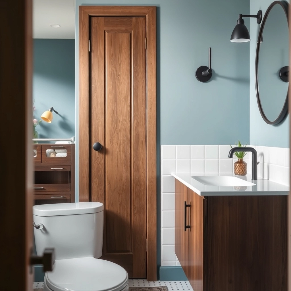
Powder blue isn’t just for your grandmother’s house anymore. It is having a grown-up moment. These powder blue bathroom ideas are for people who like a bit of history but don’t want to live in a museum. It is a soft backdrop. It is easy on the eyes when you are hungover on a Tuesday morning.
Actually, the trick is to use unexpected silhouettes. Don’t use those old pedestal sinks. Use a custom-carved stone basin. Or a modern faucet that comes right out of the wall.